
YOUNG SEARCH PARTNERS:
We find the hard to find, and the best of the best.
ABOUT OUR NAME AND LOGO
THE NAME…
The power of a name and its honor has long been immortalized in prose, poetry and religious ceremony. Everyone recognizes himself or herself by name. Its personal.
Katherine Young launched her executive search firm in 2009 with the goal of providing executive search solutions with a personal touch. With nearly 20 years experience in the executive search industry, Katherine had already made a name for herself as someone whose passion and commitment for sourcing high-quality candidates was second to none.
So when it came time to select a name for Katherine’s firm, it was easy! Simply use the name that clients already knew and the name that her clients have long associated with Experience, Integrity and Results.
Young Search Partners it’s Who we are, and it’s What we do.
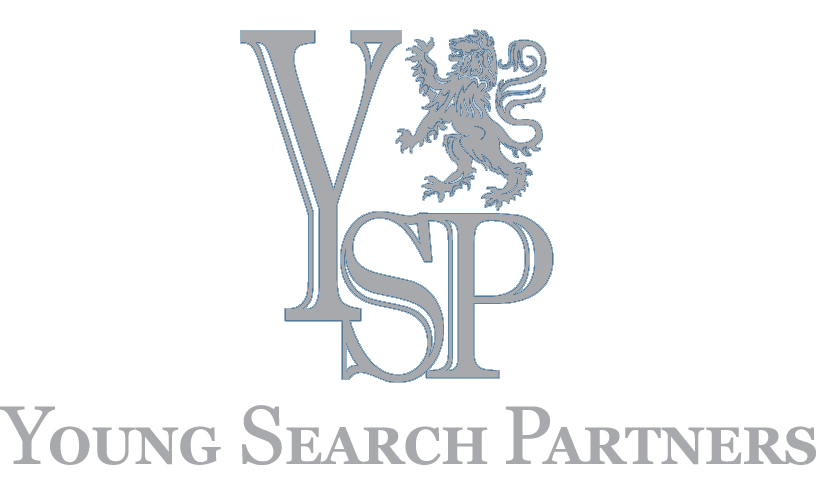
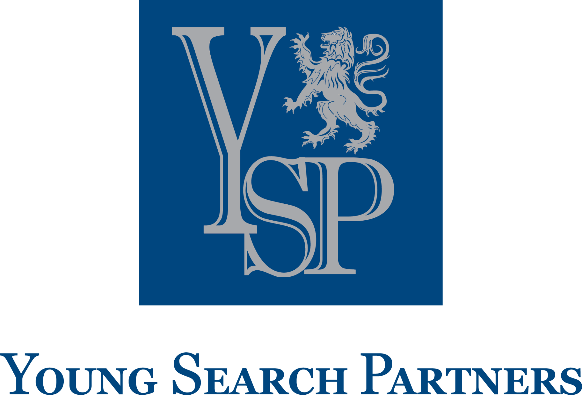
THE LOGO…
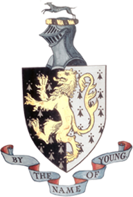
The origins of the Young Search Partners’ logo comes from the Young family crest which was originally designed and developed decades ago by Katherine’s grandfather, Lincoln Ruckley Young. The YSP logo is classic, sophisticated and incorporates the colors of blue for truth and loyalty, and grey for peace and sincerity.
“Let the beauty of what you love, be what you do"
—Rumi